Modern / Vintage
2024 BRIXTON BRAND CAMPAIGN
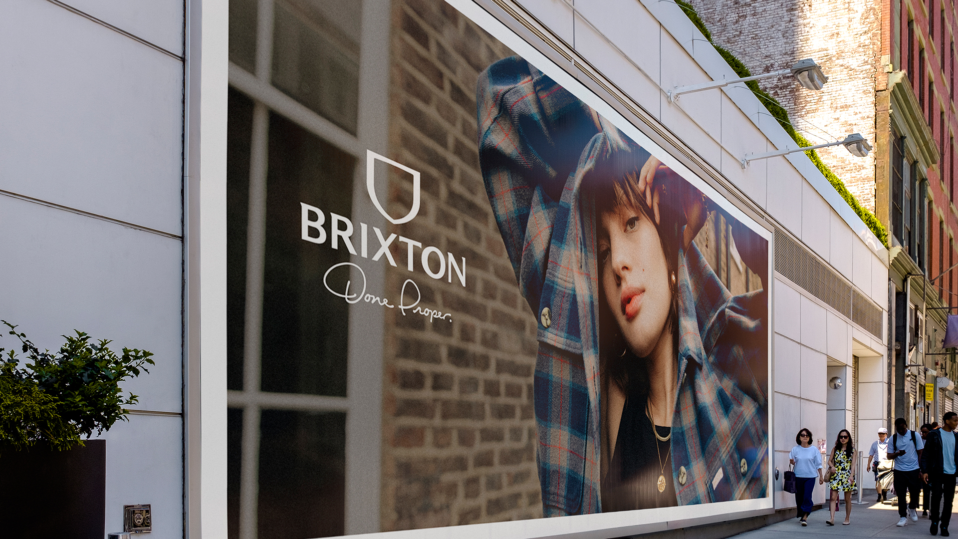
MODERN LIFE THROUGH BRIXTON’S LENS
Brixton has been rooted in vintage from day one. Driven by our ethos—“Inspired by the past, built for the present”—we’ve always honored timeless style with a modern purpose. In 2024, we celebrate our community with a fresh, human perspective, focusing on authentic people and real moments. Because life isn’t perfect—it’s endlessly inspiring.
Strategy
Creative Direction
Art Direction
Design
CHALLENGE
After years of zigging and zagging, Brixton found itself disconnected from the very fans who defined its identity—where they live, where they shop, and how they engage. A deep dive into data revealed gaps in messaging, channels, and connection points, signaling the need for a holistic approach to re-align the brand. By rethinking how we speak to our consumers, we aim to recapture Brixton’s essence and strengthen our connection to the community that inspires us.
APPROACH... LIFE ISN’T POLISHED, IT’S INSPIRING.
Through our deep dive into the data, we discovered the need to reconnect with our younger, bolder audience by reflecting what truly interests and inspires our community. This meant shifting our focus to tell authentic stories about real-life musicians, artists, builders, and athletes—our core brand pillars—while showcasing how our product fits and feels in the real world. Most importantly, we needed to embrace the grit and raw energy of creativity that defines Brixton.
To make a meaningful impact, we also reimagined how we create and deliver content. Deeper, more immersive storytelling became essential, paired with highlighting our product in a more elevated way—"glorifying" it naturally, yet purposefully. Capturing this content in the right medium and delivering it on the right channels ensures we connect with our audience where they live, shop, and engage.
Click left and right to see more


REFERENCING BRIXTON’S PAST WITH A MODERN STRATEGY
REFERENCING BRIXTON’S PAST WITH A MODERN STRATEGY
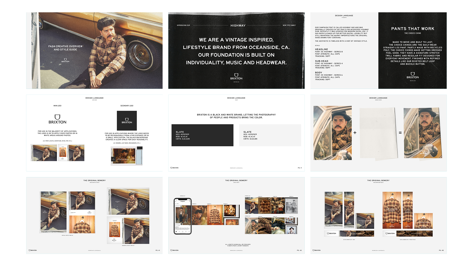
Refreshing our look and feel was essential to signal a shift in our mindset while staying grounded in Brixton’s roots. We embraced real people in real moments, captured through a toolbox of vintage-inspired textures and materials that reflect the authenticity and creativity of the people and products we celebrate.
Our visual language features messaging in a classic typeface—originally introduced in the 1940s—modernized to meet today’s design standards. This is paired with a subtle layer of distress to evoke a sense of heritage and grit, ensuring a genuine connection with our audience.
Beyond typography, our approach includes a timeless palette of off-white and washed-out black, complemented by distressed overlays and analog-inspired image making. Together, these elements further enhance the feeling of real-world authenticity while maintaining a clean, modern edge.

TAKING A VIDEO FIRST SOCIAL STRATEGY,
WHILE CHANNEL DICTATES THE CONTENT
WHILE CHANNEL DICTATES THE CONTENT
Creating the right content for each channel is essential to ensure higher engagement and sell through. Our creative strategy focuses on crafting storytelling pieces that align with the platform’s unique style and purpose. From polished, narrative-driven content to loose, raw moments, each piece is tailored to fit the specific customer journey and the context of the platform.
VIDEO-FIRST SOCIAL MENTALITY
Without video, our marketing efforts are wasted. To build and maintain Brixton fans and drive brand awareness, video is essential. Every product story includes video as a foundational element in the plan.
SOCIAL THROUGH THE LENS OF PHOTOGRAPHY
SOCIAL THROUGH THE LENS OF PHOTOGRAPHY
Photography remains a vital part of the social strategy, carrying significant weight in the customer journey. It provides the viewer with an opportunity to deeply connect with the product—showcasing how it seamlessly fits into the Brixton lifestyle.
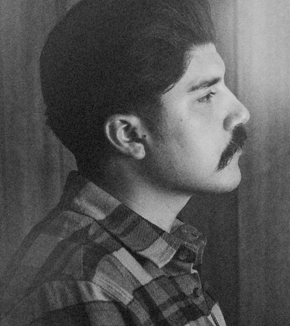
SALES TOOLS WITH SOUL
Strong sales tools are essential for kicking off a successful season. As part of the creative strategy, we focus on producing high-quality photo and video assets efficiently, ensuring maximum impact with minimal effort. The goal is to showcase product fit and quality through elevated storytelling, driving a strong wholesale sell-in.
Click left and right to see more


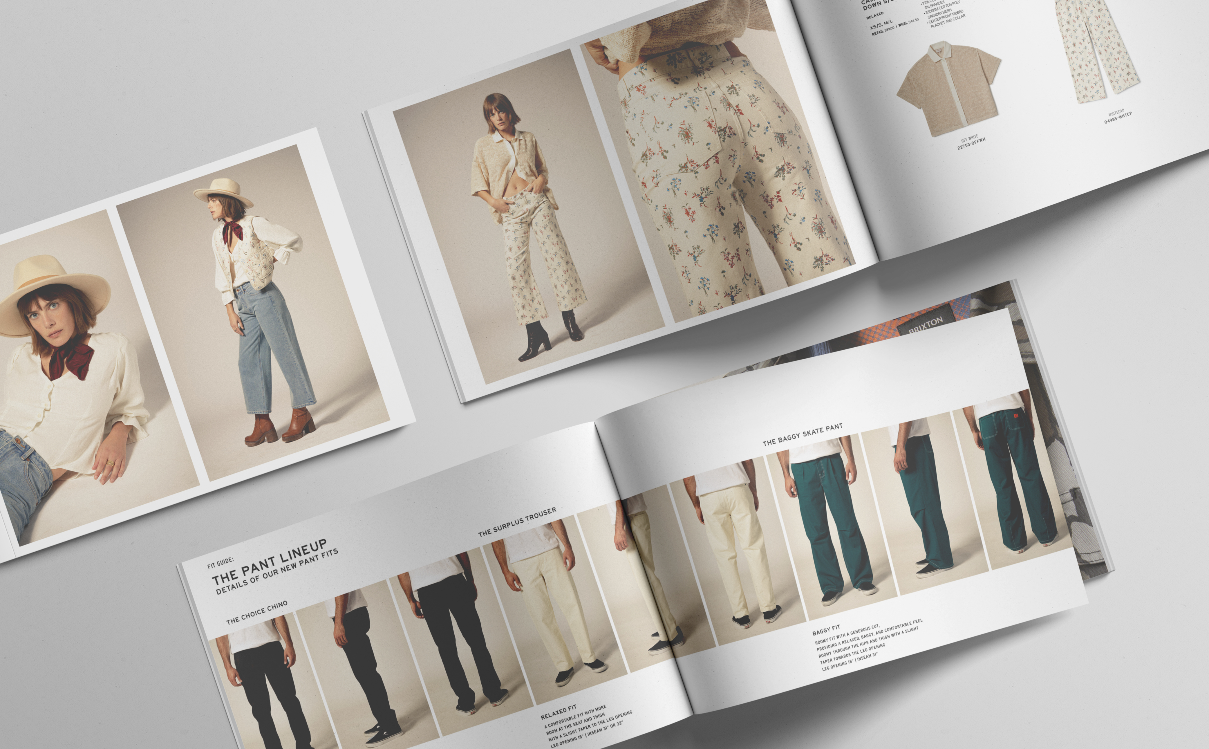
FAVORITE MOMENTS MODERN / VINTAGE
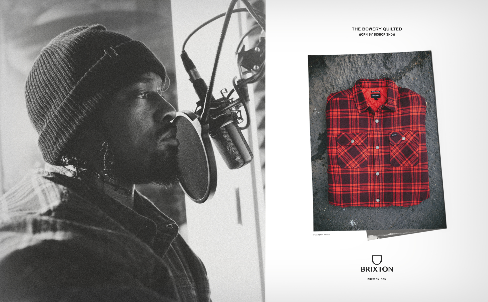
2024 was filled with incredible stories. From the city streets to the mountain tops, we celebrated amazing individuals while showcasing our products in their most inspiring light.
Click left and right to see more




A Little Help From a Friend
CREDITS
Campaign Photography - Ryan Allan
Additional Photography - Scott Sanford
Additional Photography - Steven Treboux (Sports Club)
Motion/Camera Opp - ChadSuter (Gripped Creative)
The New Explorer
BRIXTON
THE NEW EXPLORER
A fresh take on Brixton’s ethos of “Inspired by the Past / Built for the Present” brought to life for the Spring / Summer Brand Campaign.
Strategy
Creative Direction
Art Direction
Design
CHALLENGE
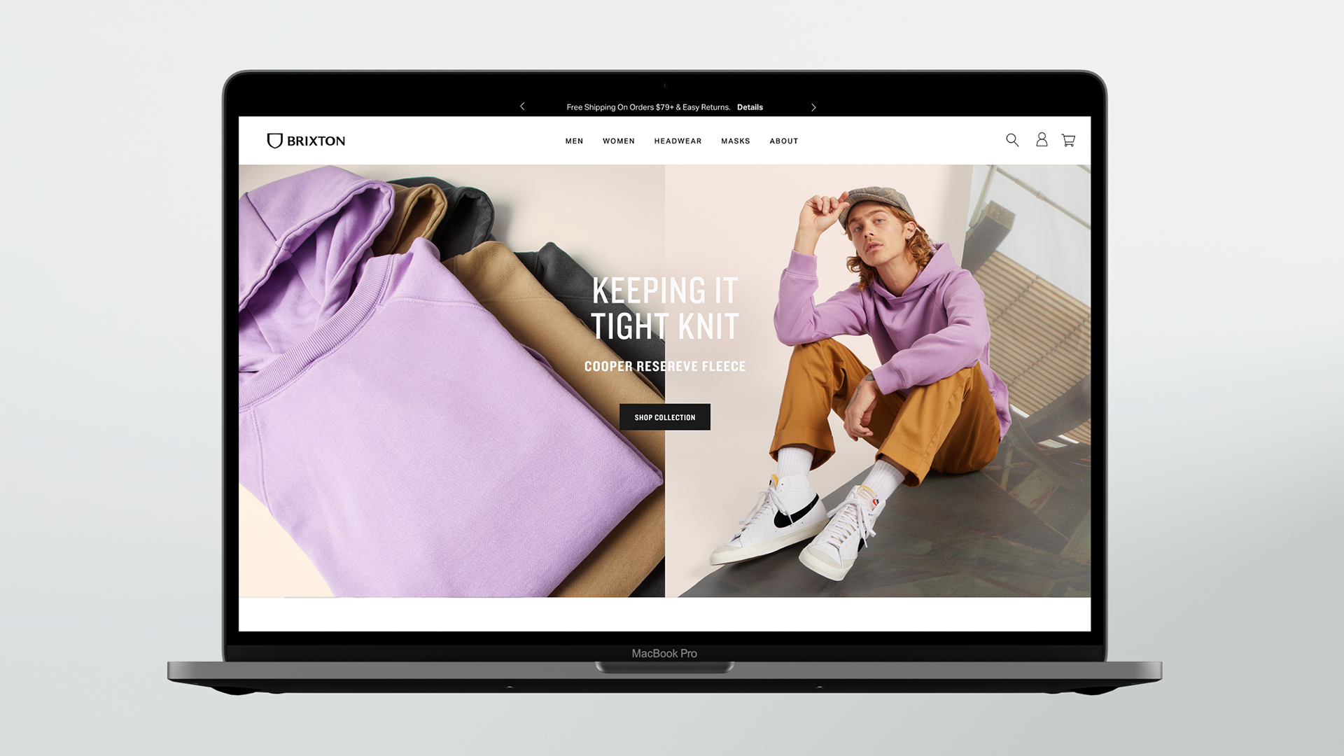
Fresh out of a newly imagined brand re-positioning “Done Proper”, Brixton needed to bring this value system to life. The direction was clear, it needs to be bright and optimistic, capture the vintage influence, and most importantly confidently play in the same space as other premium brands.
APPROACH
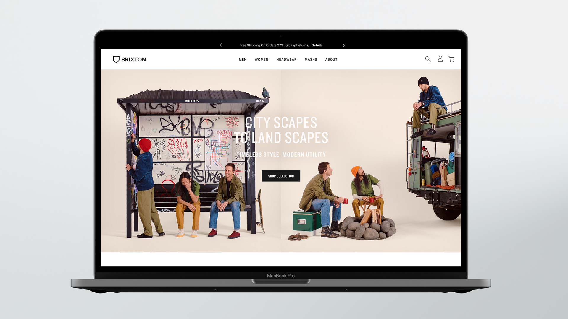
Brixton’s product team finds inspiration from a wide range of sources, but all with a clear point of view. Taking the design teams’s seasonal theme of “The New Explorer” as the jumping off point, we imagined an array of different situations the product line was designed for: The city, the ranch, the roadtrip, the hotel, camping, or anywhere else you can spend your days with your friends and neighbors.
In the setting of a studio we found that premium feel while giving the people and product its place in the spotlight without losing a sense of story and excitement. Here we let the story unfold, character by character, week by week, strategically as the product capsules are released throughout spring and summer.
Welcome to the whimsical world of The New Explorer.

Click left and right to see more
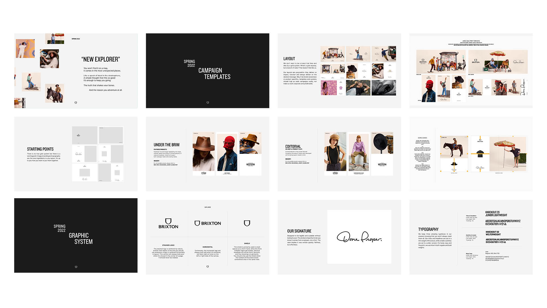
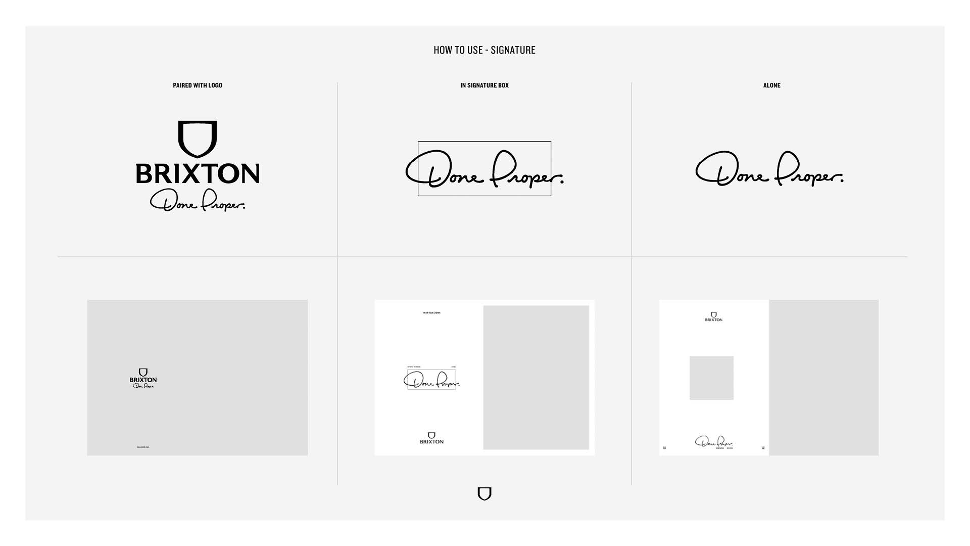
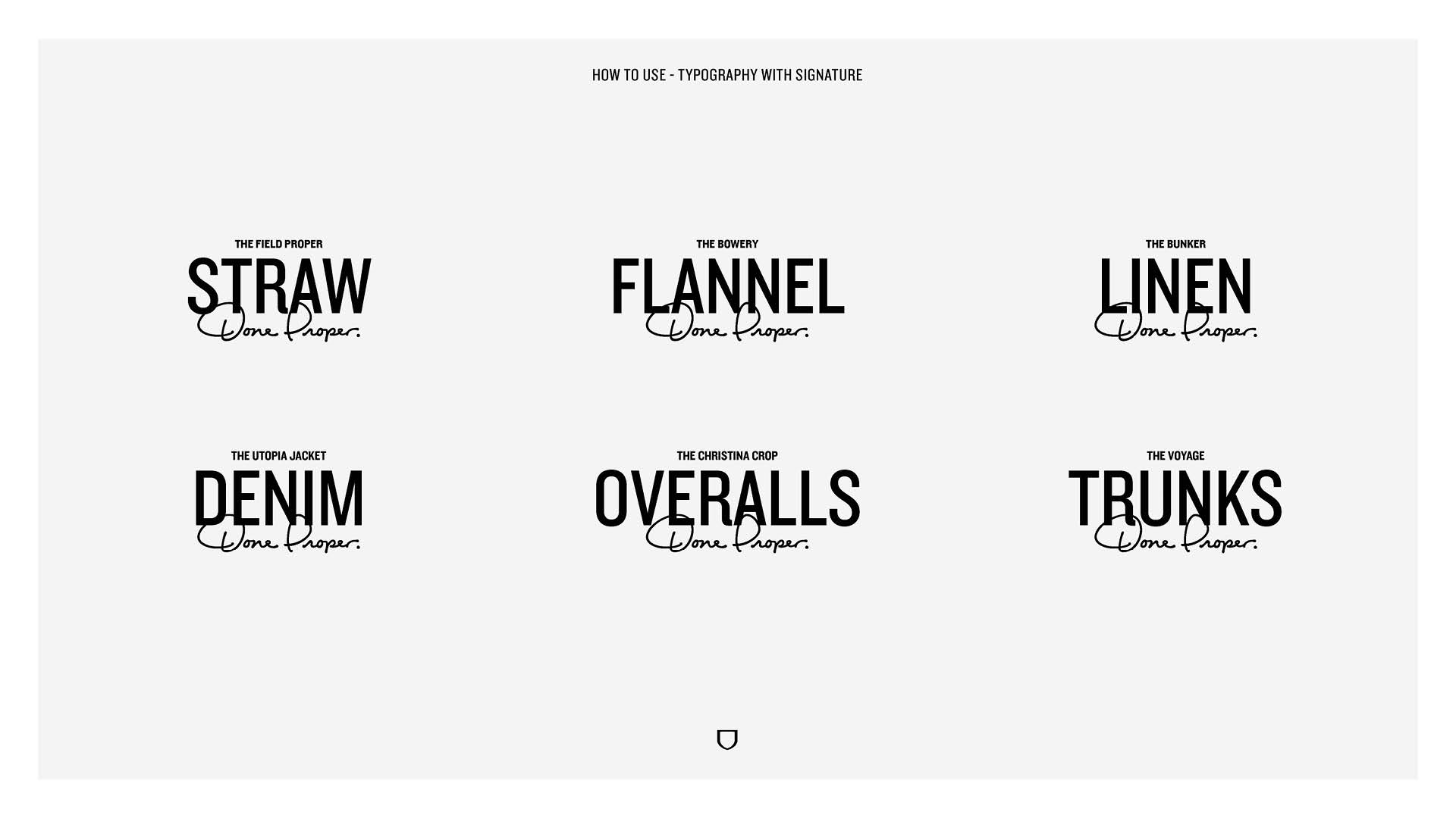
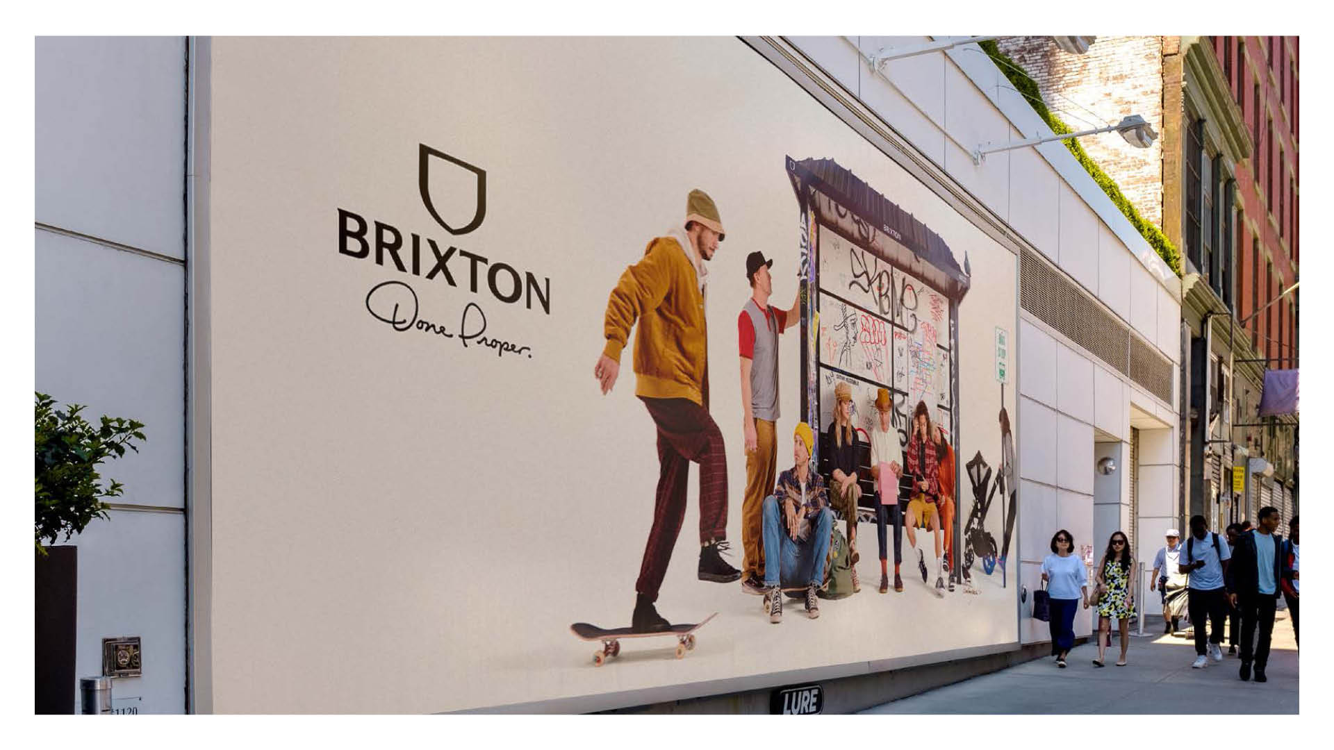
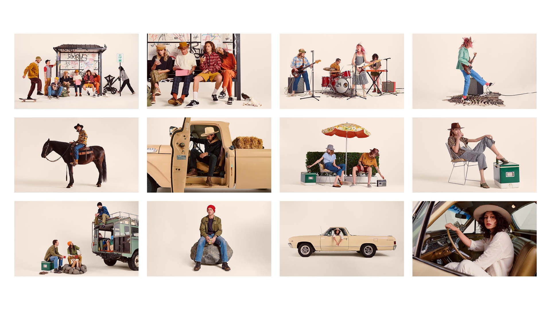
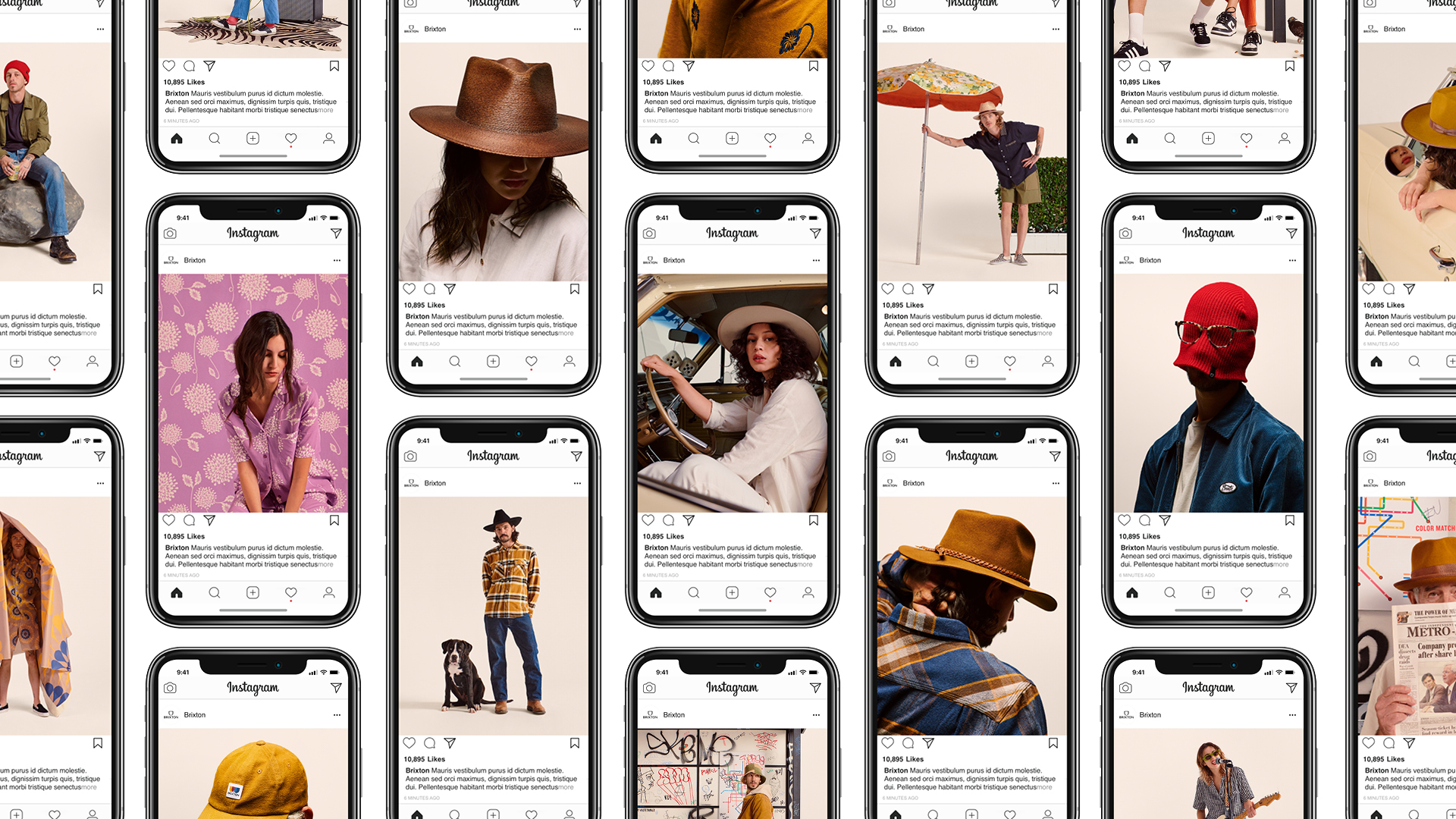
SOCIAL ROLLOUT
Our story builds week by week as we introduce new characters and situations through short video pieces. With these pieces we highlight new products through our individual characters and show the various usage occasions while also encourging people to get out and explore.Click left and right to see more
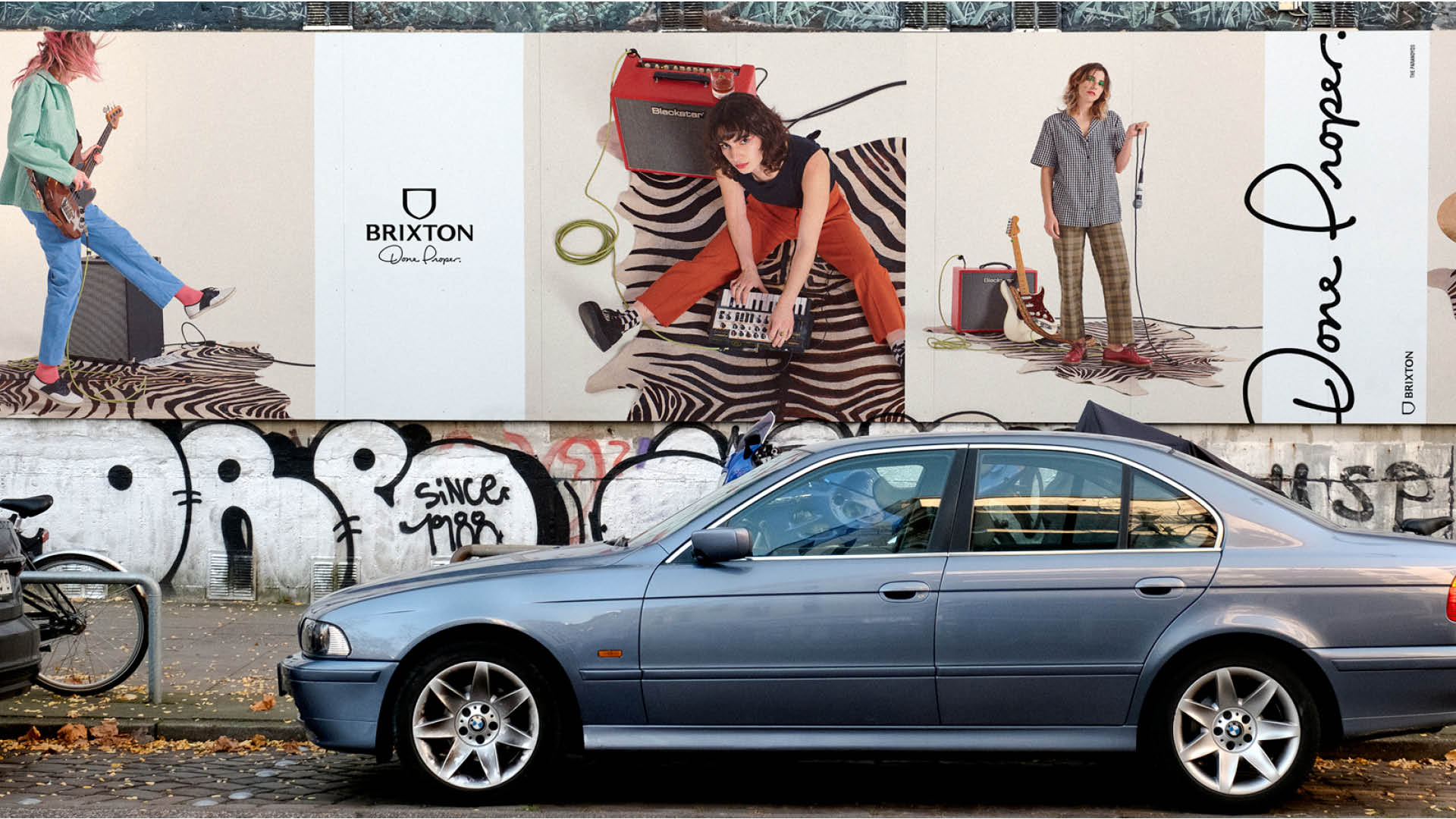
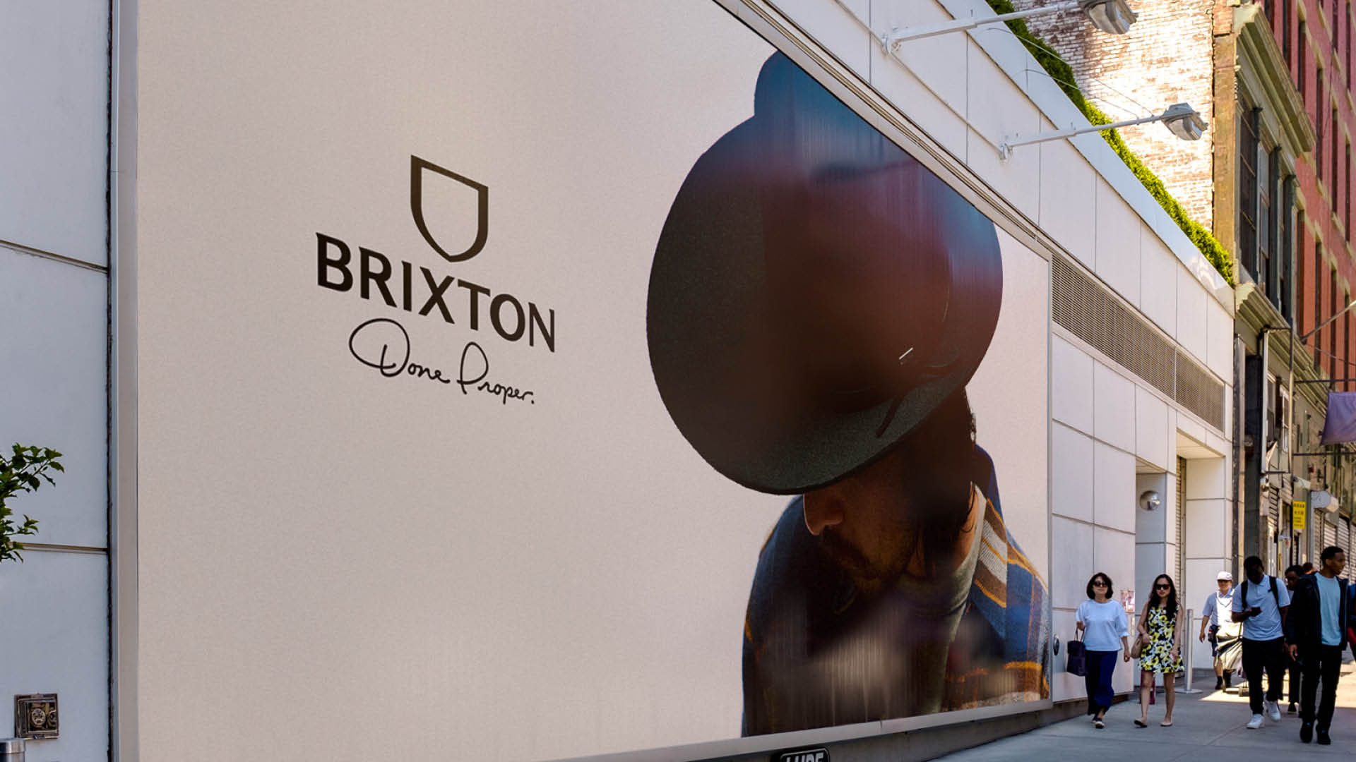


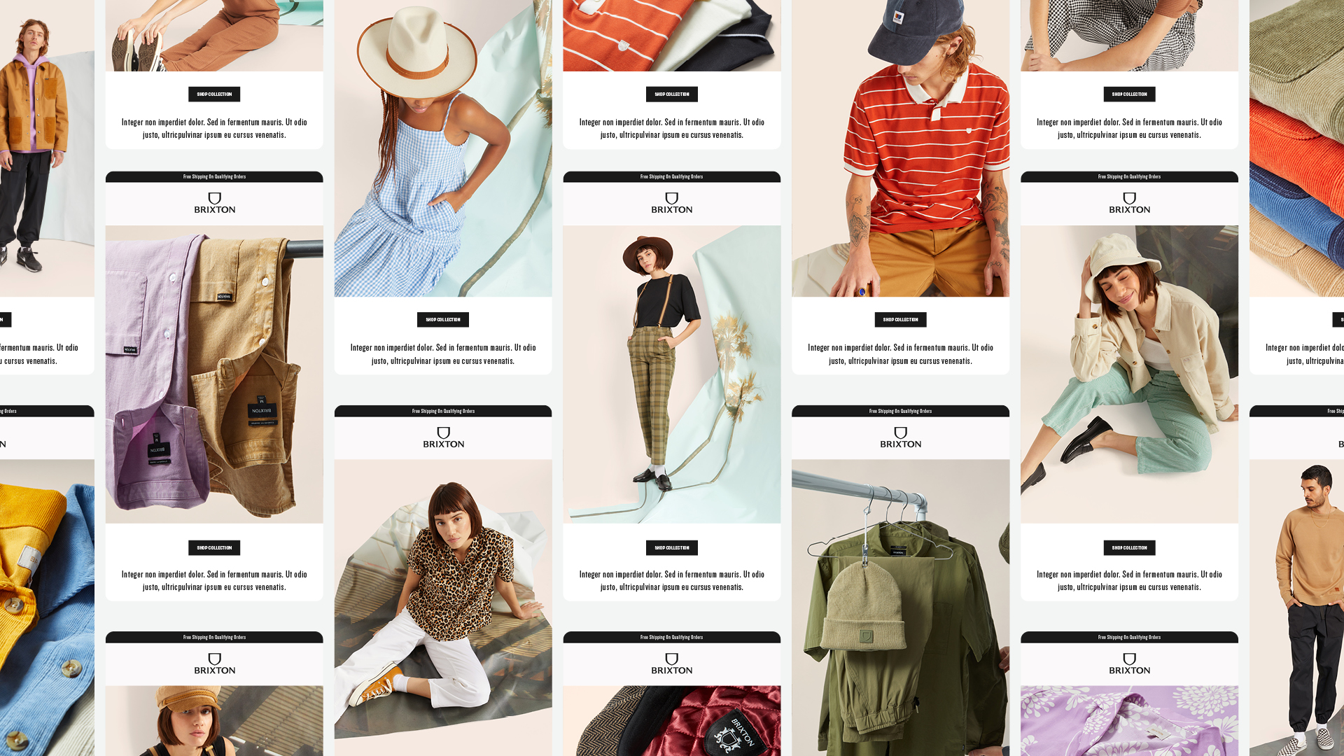
FULFILLING ALL THE MARKETS NEEDS
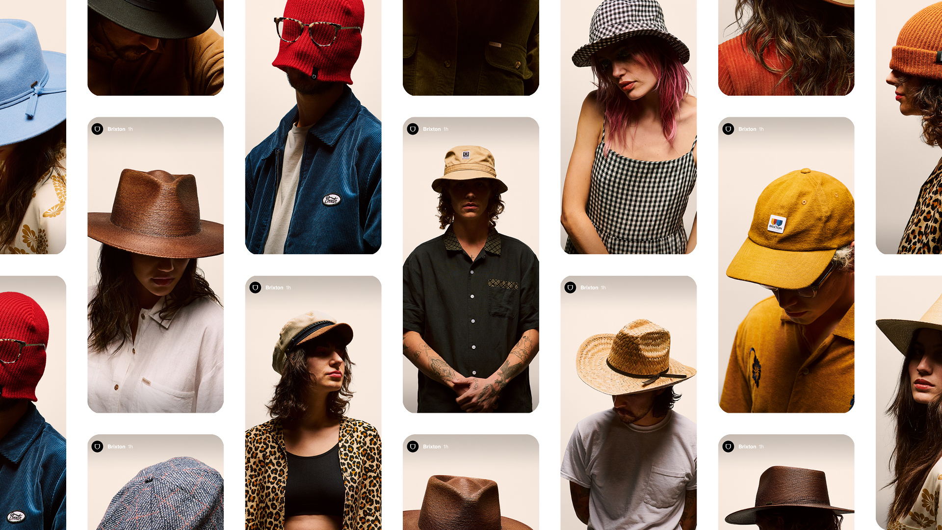
Brixton has a vast product line and multiple channels of distribution. This required a thoughtful approach to how we fulfill the various needs in strategic manner. This means creating deep storytelling pieces around key products and creating support assets around the remaining product line while pulling the same creative thread throughout all touch points. This gave wholesales accounts the same fire power and the internal DTC efforts and ensuring all channels had what they needed to succeed.Click left and right to see more
Click left and right to see more


A Little Help From a Friend
CREDITS
Creative Partner / Branding Develoment - Basic Agency / Matt Kipper
Campaign Photography - Jake Jones
Additional Photography - Jack Belli
Additional Photography - Steven Treboux (Sports Club)
Motion/Camera Opp - Josh Nardo (Tasty Heavy)
Brixton Holiday ‘22 Campaign
BRIXTON
The Holiday Gentleman & Hooligan / Lady Rebel
Strategy
Creative Direction
Art Direction
Design
CHALLENGE
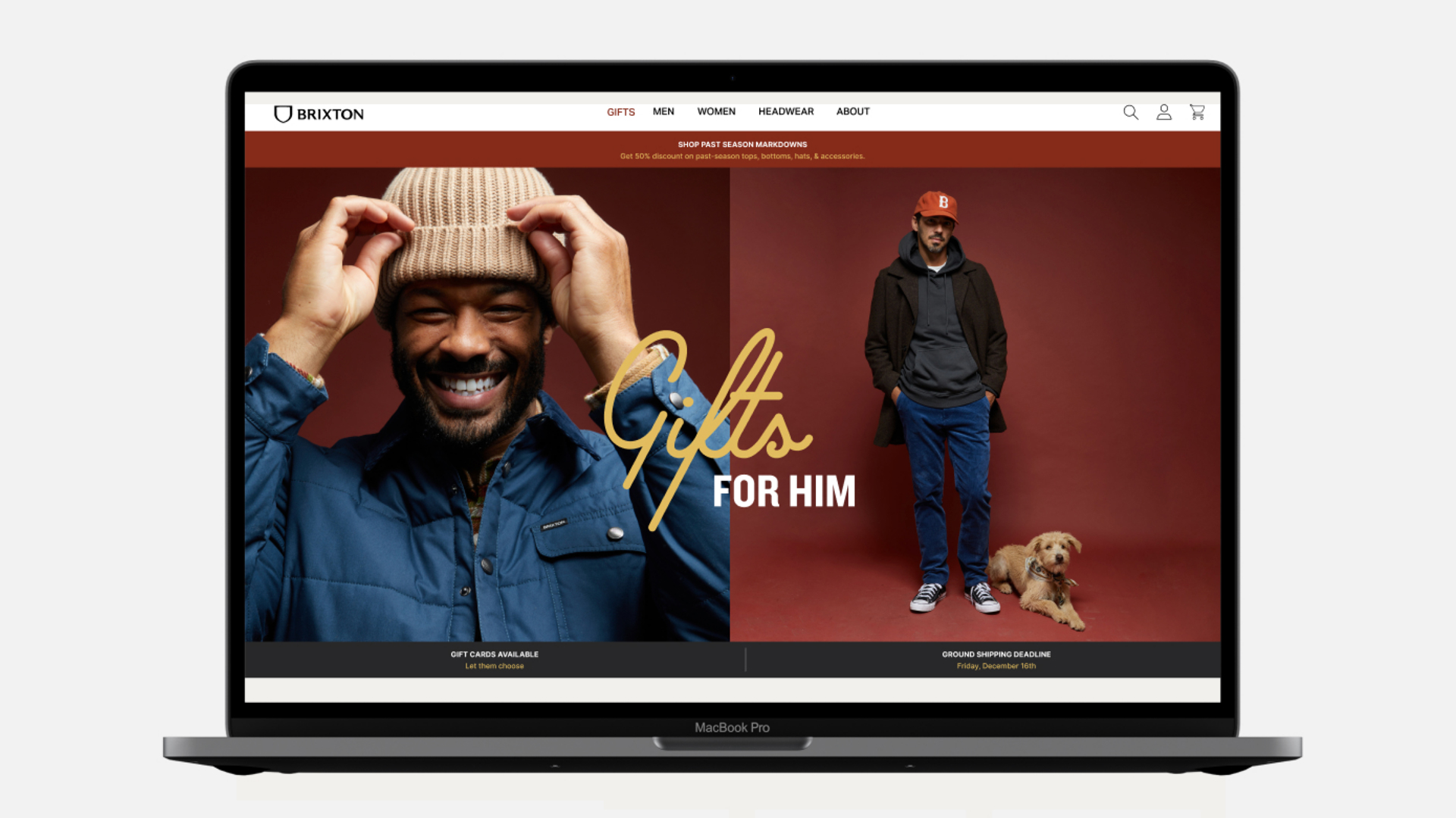
The holiday season is Brixton’s largest season for DTC sales with 70% annual sales coming in a short 2 month window. This means they have to capture the attention of the consumer has to be fast and in the right way. This season we challenged ourselves to bring the seasonal design theme to life in a meaningful way while creating enough stories and assets to cover all the needs for the long and grueling holiday selling season.
APPROACH
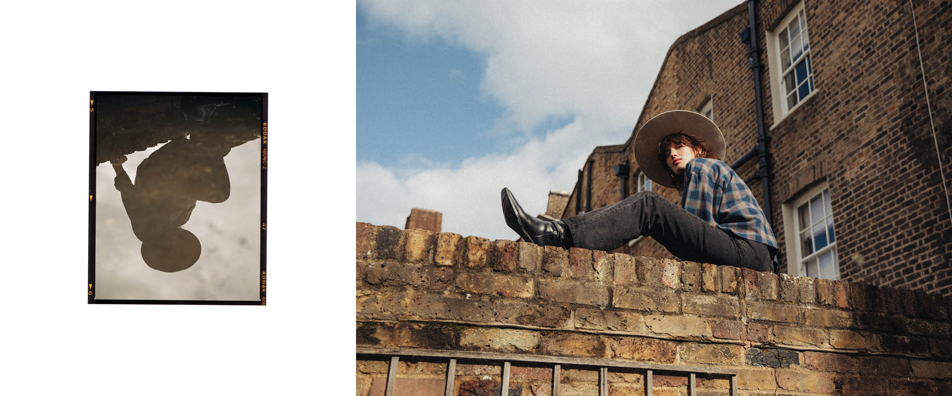
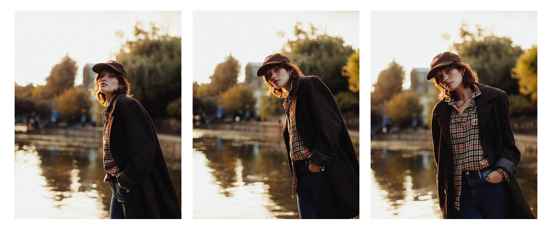
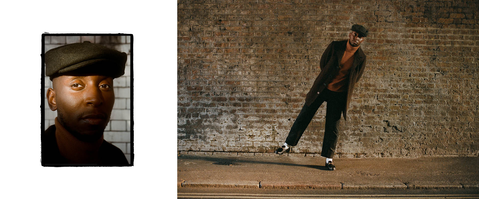
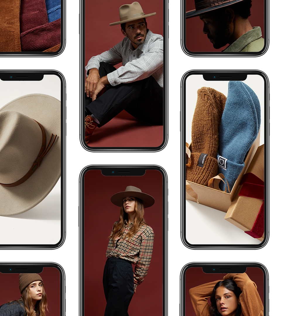
Brixton has a history of partnering with creative and talented people that align with the creative and aesthetic foundations of the company; A vintage inspired aesthetic Done Proper. This season we partnered with genre-bending musician Samm Henshaw and classically trained actress / model Bar Maldonado and met them at their home base in London. Here we expose their personal style and highlight their various talents all set in the everyday textures of suburban England.
CAMPAIGN LAUNCH
With any launch of a new product it is critical to make the biggest splash possible right from the start. We made our big splash focusing our hero video piece and getting as many eyes on it with multiple broad reach and surf endemic media placements pointing them to our site full of fun and educational content.
Click left and right to see more


Click left and right to see more

SUSTAINING THE SHOPPING SEASON
Brixton has a vast product line and multiple channels of distribution and specifically with a Holiday season. This means we typically begins as a standard season but then pivots into specific channel shopping and promotional messaging required a thoughtful approach to how we fulfill the various needs in strategic manner. Creating deep well of varying assets around key products and promotion strategy was key to the season’s success.
Click left and right to see more


ROLL - Creative Direction, Campaign Development, Art Direction
CREDITS
Campaing Photography - Curtis Jehsta
Motion/Camera Opp - Sam Friend
Styling - Ashley Holthaus
Studio Photography - Jack Belli
Studio Photography - Steven Treboux (Sports Club)
THE FLANNEL FOR ALL
BRIXTON
The Bowery: The Flannel For All
It’s as simple as it’s stated. The Bowery Flannel is a timless piece that is wearable for all. See for your self.
Strategy
Creative Direction
Art Direction
Design
CHALLENGE
The Bowery Flannel is a cornerstone product for Brixton. Besides headwear, flannel is what Brixton is known for. What is not known is the amount different fits, materials, patterns, and extended sizes available. Brixton truly provides Flannel For All.
APPROACH
Brixton has strong roots in Southern California, specifically Oceanside, CA. This small coastal town is a tight-knit blue collar community built around skilled craftsmen, artists, musicians, surfers & skateboarders which has always been the major influence on Brixton’s identity. For the Bowery Flannel campaign we gathered 25 friends of the brand to hangout for an afternoon and have their photo taken. What came of it was portrait of Oceanside and the many walks of life that reside there. And oh yeah, a great illustration of how the Bowery Flannel is worn by all walks of life and is truly a garment for all.

LAUNCH
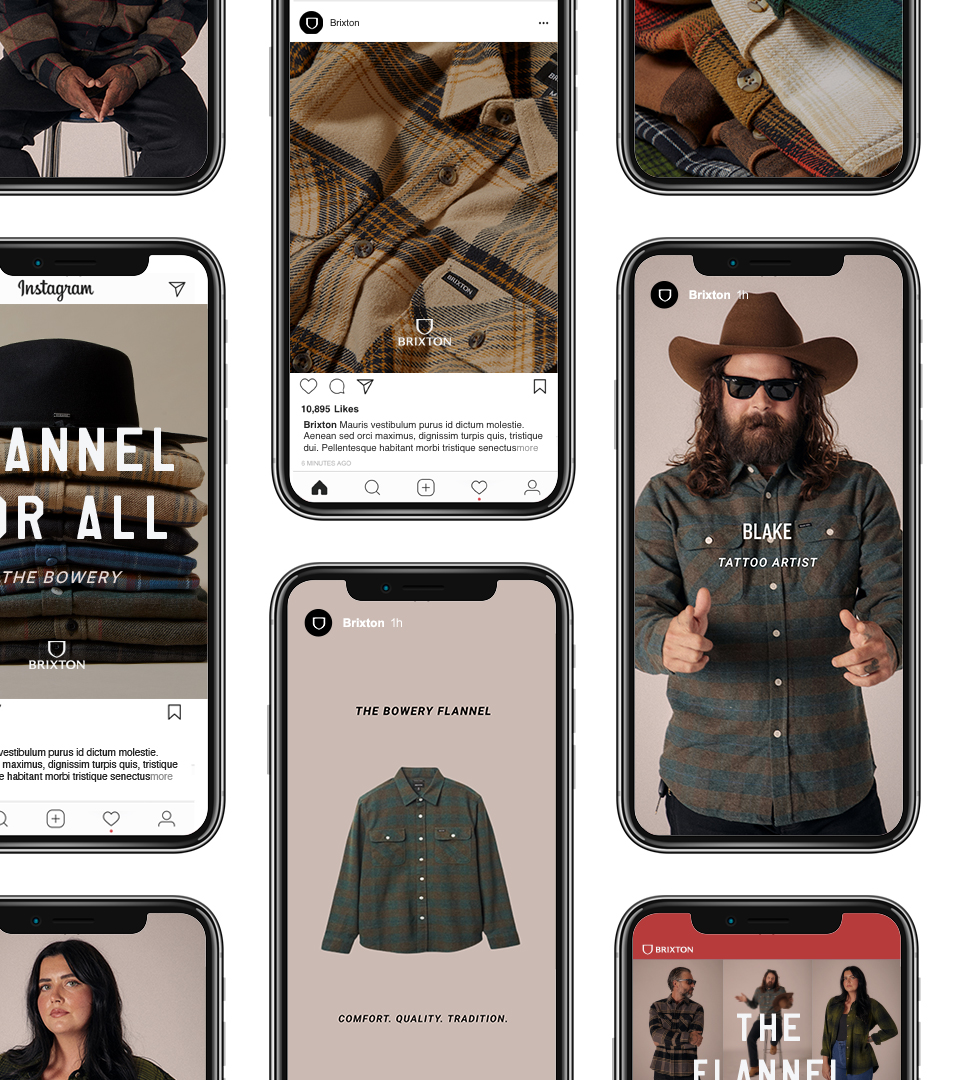
Informal but refined; three words that perfectly describe Brixton which became our approach for the campaign launch. Leading with BTS video footage of the photo shoot, we edited together a collection of moving portraits of people as they are. This showed the viewer how different people are in a community with their own unique personal style and body type while also giving the feeling of a true representation of life. No filters. No fancy editing. Just a honest representation of a community, it’s people, and how different we are without being to precious about it.
SUSTAINING THE CAMPAIGN
To continue the story of a single flannel wearable by all, we moved from the story of all to a story of specifics. Through print advertising, social media, email marketing, and digital ads we focused on individual people by showing their unique personality through a series of portraits while also featuring the specific Bowery they are wearing with product photos and details. This gave Brixton the opportunity to continue to celebrate where they came from and what they proudly make.A Little Help From a Friend
CREDITS
Campaign Photography - Steven Treboux (Sports Club)
Graphic Design Support - Jacob Coppes
Much Love to the Friends & Families from Oceanside
